ShopDreamUp AI ArtDreamUp

Deviation Actions


Description
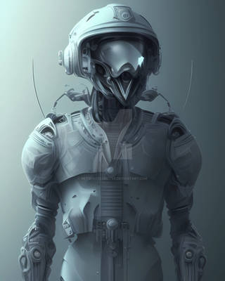
sad robot has a broken heart....or a uh... broken power unit.
Used: Alchemy, Photshop cs5
Time: about 5 hours
Used: Alchemy, Photshop cs5
Time: about 5 hours
Image size
735x900px 437.38 KB
© 2012 - 2024 LilyOndine
Comments77
Join the community to add your comment. Already a deviant? Log In
First off, I should say that I was absolutely captivated by this piece. So much so that I left the window open on my computer overnight so that I could remember to critique it for you. Your character really pops against the simple background, and is well framed by the simple foreground that echos the same mechanical style of the robots body. The use contrast is great- I find it appropriate that the robot's face is the brightest part of the whole picture. I also love your use of chiaroscuro on the areas where the robot's feet meet the ground, the forearms to the hands, and the areas up by the shoulders.
However, a few things that I would recommend: the background lighting is quite inconsistent on the bottom half of the painting. For example, the area between the legs is much brighter than the area that is just outside the legs. Also on either side of the painting there is a straight-cut line in the lighting that hits at about the middle of the forearm. It looks intentional, but I am a bit confused by it's intention. I feel that it was your attempt at creating one of those dramatic, ray-like shadows that you sometimes get when you have strong backlighting. However, I don't feel that that the light source behind the robot has enough strength to create something like that. Judging by how it radiates in the background, it appears to be a very soft light, therefore, a sharp, high-contrast shadow like that is unlikely to be created by it, making it look like a mistake. It also sticks out and is a bit visually distracting because it is is the only time that the light is not softly blended. I would recommend softening that line out and blending it back into the background.
My last recommendation would be to go back in and buff out the areas under well, what I guess would be his armpits, haha- It is just very easy to see the small brush that you used to try and clean up that area in all of the little triangle streaks that left behind. They distract from the soft lighting and overall feel that you've created in this piece.
I really love this, though. Visually captivating, conceptually interesting, (cute!), and a very imaginative, inspiring design.
Great work! <img src="e.deviantart.net/emoticons/s/s…" width="15" height="15" alt="